I would regard Tufte's work as a kind of textbook for information design students. I think the most important things for reading these books is to remind us that the need of "information design" has happened long long time ago. As a information design students, we should always be conscious about what has already happened in the history. Save our time and energy for those 'unsolved puzzles'. Although reading always take lots of time, I believe it will save my time in the future while facing design decisions. Despite the fact that I am not 100% agree with about his points, especially which about the "redesign" he proposed, I do appreciate his enormous historical collection of information graphics, which might be easier to grab the main ideas comparing with today those dazzling, over decorated information graphics. He even put lots of his collections on his
website (for sale).
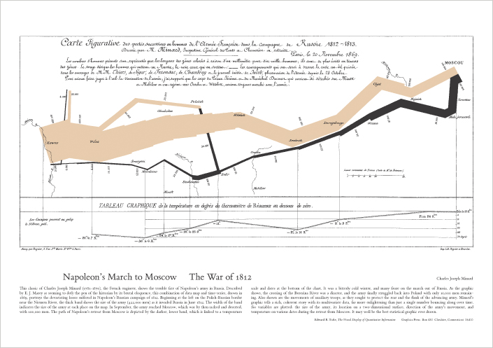
Taking Napoleon's March to Moscow of 1869 as an example, which indicates many different information on one paper, including the number of the army, the route of march, degree, important dates, and temperature (which might be the most deadly cause for the death of soliders). It might be the most classic example to state that how information design could put multivariation in the single two dimension space, then tell a comprehensive story.
After reading his book enables me to rethink the necessity of 'interaction design' in information design. If I could tell my story in one graphic, then why do I still add some interactions, which might even make the design more complicated. In short, my personal comment is trying to embrace the different natures of different medium.
Tufte has self published three books in a row for his strong passion. Those books are: "Visual Explanations: Images and Quantities, Evidence and Narrative", "Envisioning Information", and The Visual Display of Quantitative Information". I found there are few overlap among different books, but it didn't bother me too much by treating those overlap as a sort of highlighting. In addition, I pretty like the way he organised his content with proper title and clear summary in the end of each chapter.
Following are just some personal notes.