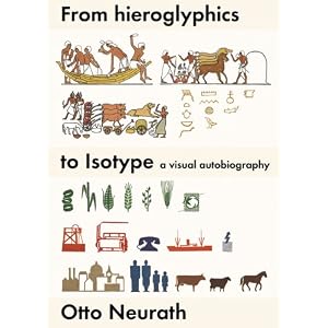
This book is talking about how Neurath developed the idea of Isotype (Isotype for me, it is just similar to the concept of icon in US or pictogram in EU). Although it seems really nature for me to use icon in my UI design, the icon was a whole new idea in 1940. It also remind me of the fact that something not familiar to us today might be popular tomorrow. In addition, I could grab the main purpose of using Isotype, that is, to communicate, which could also be treated as a guideline for facing any design decisions.
The subtitle of this book, a visual autobiography, also indicate this book is a sort of autobiography full of the visual resources Neurath collected in his whole life, and how did he develop his idea that simplification pictures could help communication. Another comment for me is that I should go back to my hometown and help those educators to redesign our over decorated, uninformative textbooks. However, I would argue the pace of this book is a little bit too slow for me. If I would like to review it as a designer, I might just focus on the chapter 5, "the renaissance of hieroglyphics", yet, to educate a future designer, I might go through the books from the very beginning.
The followings are just few more points inspiring to me.
1. Reduce noise for better communication
2. "Visualisation is a transfer of information or an emotional attitude." (p.4)
3. "Visualisation could be regarded as a kind of public service." (p.4)
4. Exhibition is a stage for information designer. And exhibition is also a sort of adult education.
5. Isotype: a combination of informativeness and attractiveness. (p.5)
6. He also mentioned about the role of designer is most about "combining visual objects" rather than drawing.
7. schematic shading might be a useful way to communicate the 3d shape without too much noise
8, Give children more than nursery books
9. Details should explain something, otherwise, inessential detail, should be eliminated.
10. Good information design could also be found in zoological, engineering, atlas, math (geometry, topology) books.
11. Simplification of colours might harmonised with simplified contour better. and the simplification also helps people understand how one thing functions.
12. Parallel projection might be easier to understand than orthodox perspective, although orthodox perspective is much more real. ( Real = anti-symbolic? )
13. He prefer: "sequence stages", "complete stories", "books > advertisement", "expressing by minimum lines"
14. The sequence of objects and pictures in the museum should be clear and informative.
15. He has the ambition to create an international language, "a unified means of communication".
16. "What a pity that neither the Egyptian signs nor other elements of the many picture scripts have been spread throughout the world as internationally understandable symbols."
17. The basic technique of Isotype: "We cut out the symbols - little silhouettes of cows, goats, potatos, ploughs and human beings -from coloured paper, so reducing the outlines to minimum, and of course avoiding internal lines whenever possible."(p.101)
18. "We tried not to present more details than are needed for quickly grasping the main points of a picture." (p.104)
19. "On the whole: the symbols used should be as self-explanatory as possible and understandable without the help of words." (p.105)
20. ".., to represent a great many easily distinguishable shades we can usually use only white, blue, green, yellow, red, brown, grey and black in pictures; purple and orange can also be employed."
21. About the "physiological colours"...a bright red spot on a blue-green shade would look like a mountain not a hole.
22. Exhibition, adult education, could also exhibit in department stores.
23. "... whereas an Isotype film, if not fully understand, is gone once and for all." (p.119)
24. "from which I inferred that our Isotype show was very attractive but not very informative." (p.119)
25. Comparing is easier in still images than in motion.
26. "One should never think of motion as an advantage in itself, just as one should not think of three-dimensionality as an advantage in itself either." (p.123) Actually what pop up in my mind was 'interaction' instead of 'motion', but the substitution still makes sense.
27. The different white on paper and on screen
28. "Experience has taught us that visual presentations tend to overlap one another in memory. That is one of the reasons why we try to make the various Isotype as different as possible within the given framework of vocabulary, grammar, and style." (p. 125)
29. "One cannot write in a neutral way without being boring, but one can present a neutral and nevertheless attractie picture."(p.125)
30. "... who, like myself, want to be as all-round as possible"

沒有留言:
張貼留言